We built a CNN to detect and count refugee tents in the Gaza Strip to quantify the humanitarian impacts of the war and better distribute aid to displaced populations.
Project Overview
| Motivation | Ongoing conflict in Gaza has led to large-scale displacement with restricted visibility into population movements, limiting human rights violations documentation and aid delivery |
| Model | A CNN that can produce accurate counts of refugee tents from satellite images |
| Client | Forenic Architecture & United Nations Office for the Coordination of Humanitarian Affairs |
| Status | Complete |
| Outcome | Produced historic estimations of displacement from start of October 2023 conflict and live monthly estimates of displacement clusters for OCHA |
Way back in 2024 I posted a graphic comparing civilian deaths in the Gaza Strip to other 21st century invasions that got me banned from Reddit. Since then, I have been looking for ways to contribute in whatever way I can to reducing suffering from the invasion (besides donating, which I already do, to UNICEF in Gaza), since it seems that dominant institutional forces have no interest in doing so.
Protests are well and good, but tend to be better at raising awareness of issues than effecting concrete change, especially when the general public is already seemingly unsupportive or ambivalent to the cause area. Regardless, with my skill set and resources I imagine there are slightly more impactful routes open to me.
One concrete action that can definitely be done for essentially no cost (except for time) is documentation of war crimes and human rights abuses using OSINT methods and publically available data (e.g. from news reports, social media, or satellite images). Obviously I don’t have the connections to do this justice myself, so I reached out to Forensic Architecture (who are already doing this) to see if they needed any volunteers for their Cartography of Genocide project, which tracks military actions and potential war crimes in the Gaza Strip. Evidence from this project has been submitted to the International Court of Justice (ICJ) in support of the South African genocide case against Israel. From the looks of it, it seemed like the main Cartography of Genocide map on the Forensic Architecture site hadn’t been updated for several months.
What started off as a simple email volunteering to do data annotation soon spiralled into a major project, after researchers at Forensic Architecture found my CV and website (side note: this is exactly why communicating your work in a searchable way is a good idea).
Instead of annotation, Forensic Architecture proposed a new project. The goal was to find a way to use machine learning on satellite imagery to do the annotations, instead of having manual volunteers (e.g. me) spend countless hours doing menial work. The prime candidate for these annotations was marking refugee tents to better enable tracking the humanitarian impact of the war on displacement, including displacement patterns and alleged bombings of refugee encampments. Knowing exactly how many people were displaced and when was a major puzzle piece in communicating the true impact of the war on the people living in Gaza. Unfortunately, tracking this is intractable for human volunteers. Doing so essentially involves annotating every tent in the entire Gaza Strip, and there are hundreds of thousands of them, for a number of different time periods (and each displaced family moves their tent at least monthly, as different areas are bombed or become occupied by the IDF).
So, the project became tracking the movement of displaced populations in Gaza, from the start of the war in October of 2023 until the present day. Data from this analysis would enable Forensic Architecture support future court cases involving human rights violations.
The Problem
Note: For this section I will be writing assuming those reading believe that humanitarian crises are bad and the impact of war on civilians is a net negative.
Displacement in the Gaza Strip following the October 2023 war has been immense. The UN estimates that 1.9 million people (90% of the entire population of Gaza) have been displaced, with some being displaced repeatedly (ten times or more). Israel restricts aid into the Strip, invariable banning aid agencies from bringing in shelter supplies as well as food and medicine.
Israel has also been accused of directly bombing the refugee settlements built in the rubble of destroyed civilian residential areas.
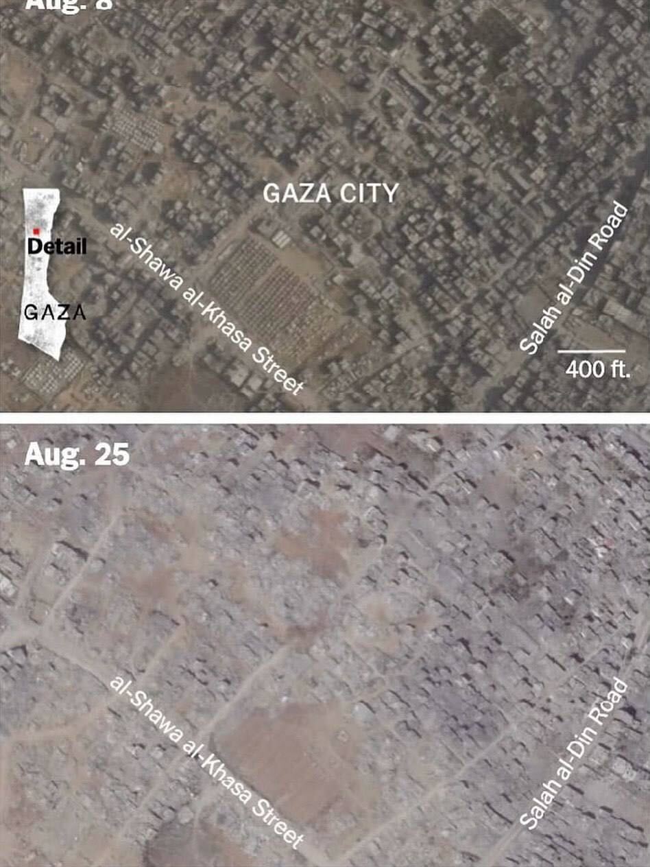 Refugee settlement in a residential block of Gaza City flattened along with the surrounding neighbourhood in August, 2025.
The accusions made against Israel are incredibly serious, so it makes sense to demand rigorous evidence, especially when international legal action is being considered. Forensic Architcture contributes to this evidence by closely analysing satellite images to track building damage, military movements, and – relevantly – displacement.
As mentioned, this process is incredibly labour intensive, especially when applied to tracking individual tents. It simply cannot scale to the level that is needed for tracking the full impacts of displacement.
As a result, Forensic Architecture’s set of annotations is missing quite a bit of data and cannot be considered complete. Without a fully annotated map, the full scale of displacement cannot be quantified with a reasonable degree of confidence.
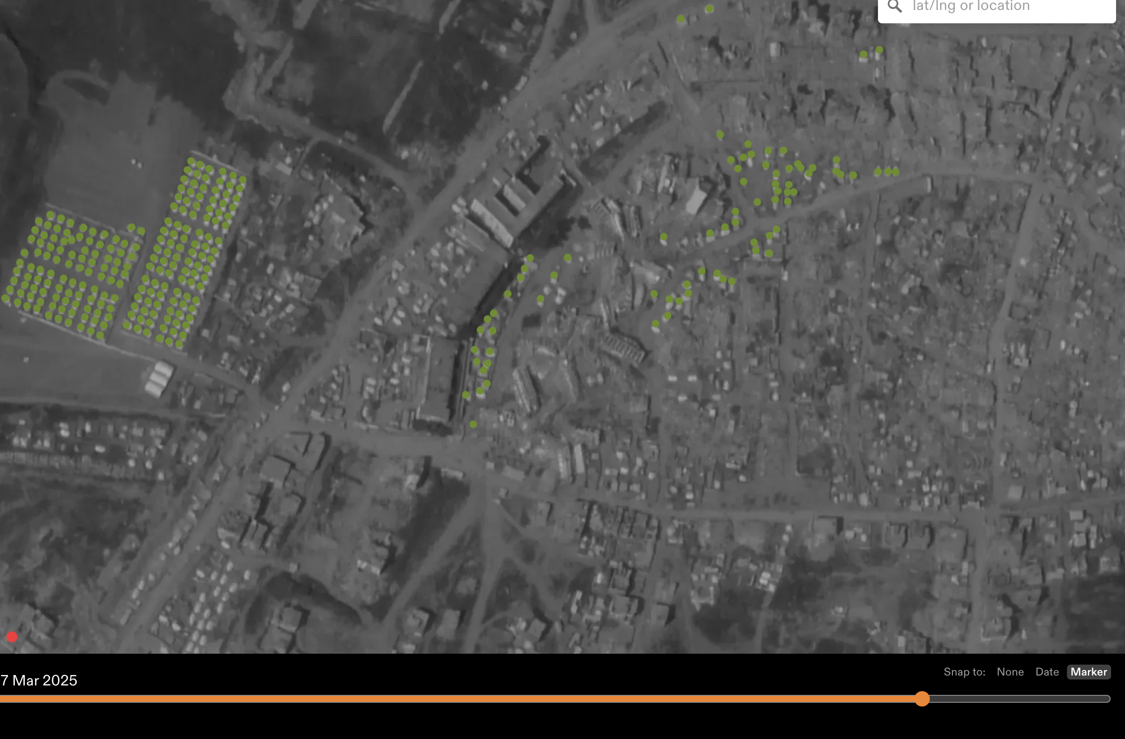 Example of missing data from the Forensic Architecture annotations. The tents are in white. Clearly the annotater for this region did not label every tent in the region they were looking at (understandable, since this is very time intensive).
A machine learning model that can do this detection autmatically would make quantifying the full scale of displacement possible, so that’s what we set out to do.
Working with the Data
From a model-building perspective, the missing data presents an entirely different challenge: the training data is extremely poor quality. There are sprawling refugee camps with complex networks of tents that entirely lack annotations. All this results in a very confused model that is told it is wrong when it correctly makes predictions in these inaccuarately labelled areas, since that is the only ground truth data we have to work with. A confused model then becomes less confident at making predictions in areas where it should be very confident. If we just gave a model this data, it would likely miss huge tent clusters, preferring to conservatively guess that no tents are present since it is often punished when it (correctly) detects tents.
At first, my collaborator, Karim, and I tried to get around this problem by writing data selection logic that only used annotated areas where we were pretty sure there was reasonably good quality in the annotations.
To make training the model on the massive satellite images possible, we first broke down the annotated images into tiles, producing a manageble segmented set of images for model to learn from. We then tried to only include tiles in the training set that (1) had some degree of annotation on them (so just weren’t entirely missed by the human annotaters) or (2) were somewhat close to some area that was manually annotated.
This was a far from perfect solution, since (as you can see in the image above), even areas that the annotaters were clearly looking at were missing a lot of data. So, our first-pass model was not great.
Another potential solution (getting blood from a stone) was to try first segmenting the image tiles, then have the model learn unsupervised patterns that represent tents. Unfortunately, the image segmentation part takes a very long time to run at scale for hundreds of thousands of tiles. So, this idea was abandoned.
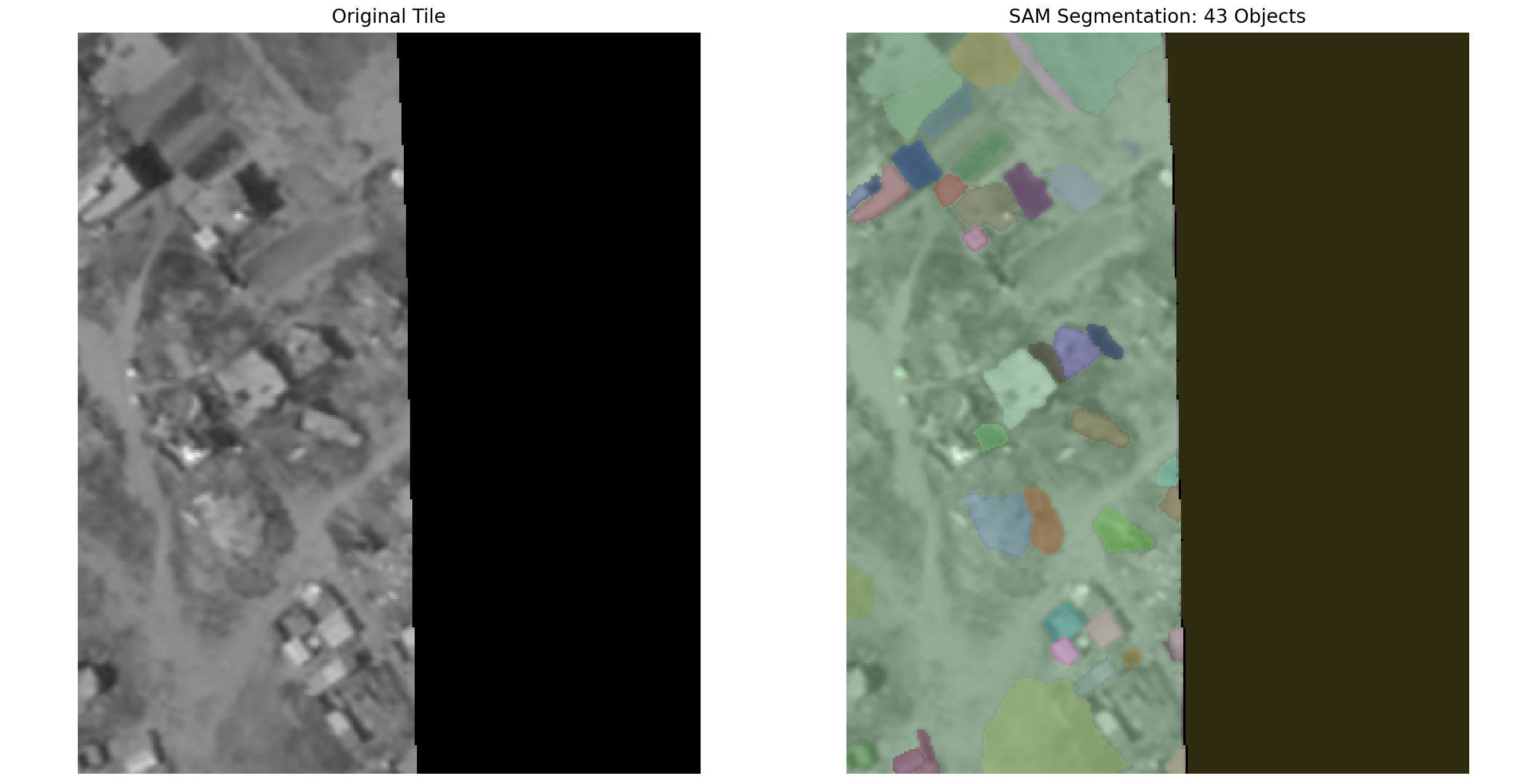 Example segmentation with the open-source Segment Anything Model (SAM).
The data quality set us back quite a bit, and ultimately we had to go back to the drawing board and just redo some of the annotations (but in a more focussed way, just choosing a representative set of images and dates for annotaters to focus on).
This process took over a month and 40 volunteers, but the result was a much better (and actually usable) dataset.
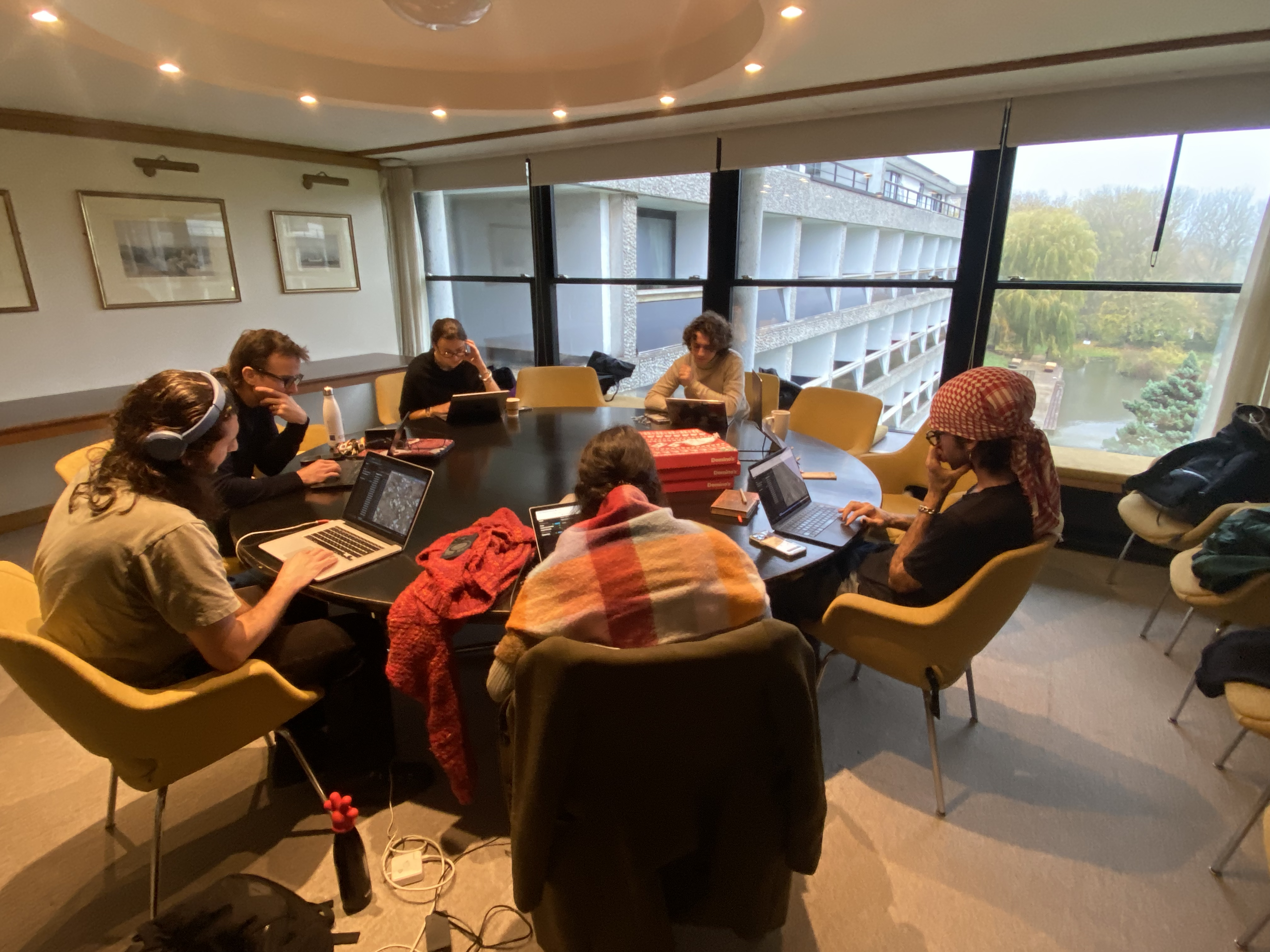 Volunteers hard at work doing annotations for this project.
With this new data on hand, we were able to build a proper model (which we called TentNetFA). Specifically, we ended up going with a relatively simple CNN. This not necessarily the best approach, since more computationally complex models like U-Nets (which are a specialised kind of CNN that uses an encoder-decoder structure and skip connections to preserve spatial detail), are much better at object detection-type tasks. However, the downside is they are much slower to train and much more computationally expensive. On a budget for both time and compute, basic CNNs (i.e. with no encoder-decoder or skip connections) were the winner.
One of my favourite parts about building machine learning models in different domains is learning and using specific domain knowledge to improve models. Some engineers go into these tasks with a very domain-neutral mindset, and as a result fail to incoporporate critical information or design features that make there models maximally useful. For this project, the most obvious improvement came from looking at pre-war data. This was made clear from working with the annotation volunteers (and doing some of the annotations myself). Being able to flip back and forth between the current satellite image and the pre-war image for the same area was critical for being able to tell whether some white blob was a tent or not.
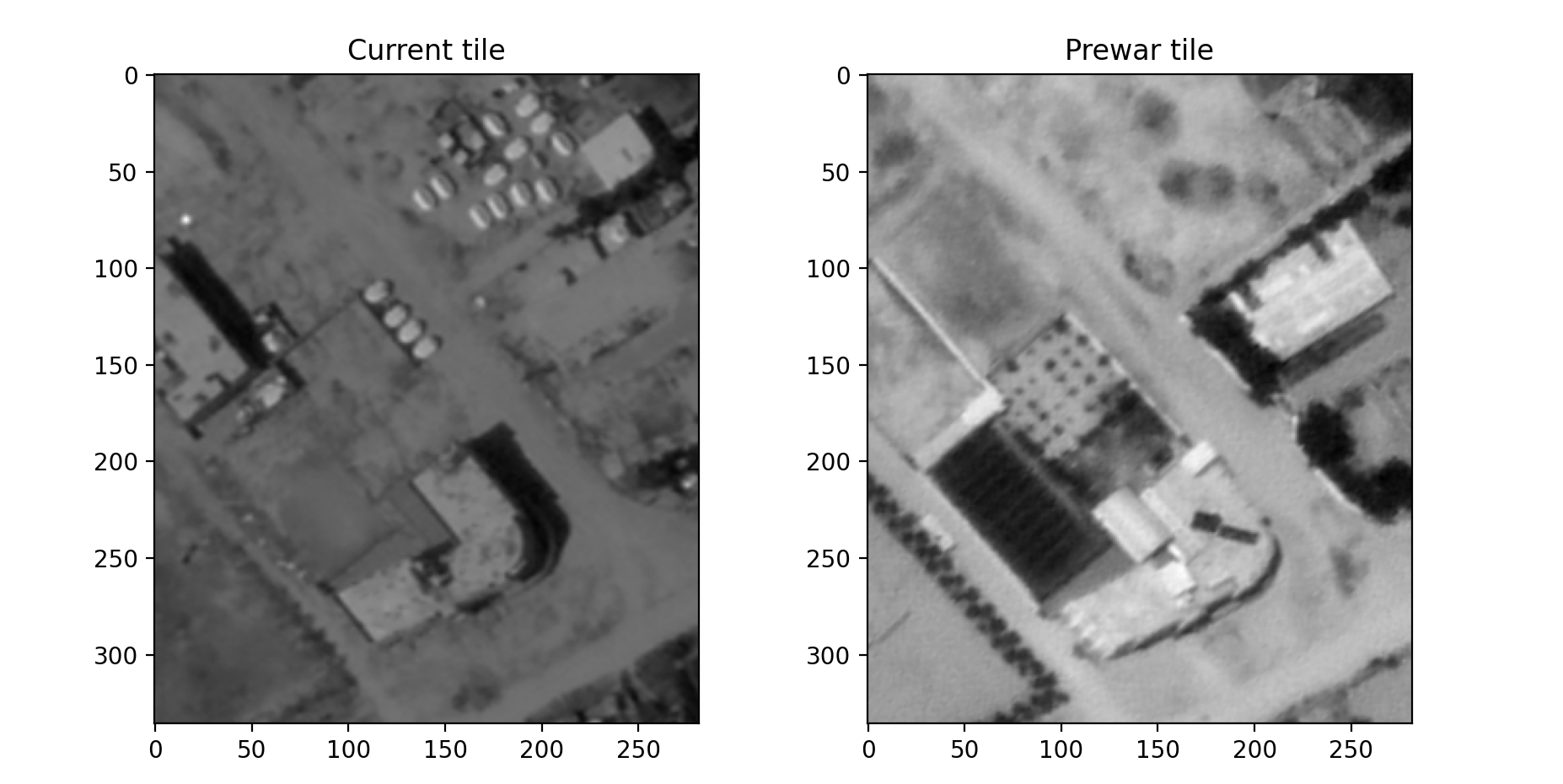 Displacement tents only show up after the start of the war in October 2023, prior to that areas with tents were mostly empty fields or residential buildings.
Clearly, also giving the model satellite images from before the war would be incredibly useful in helping it learn where tents are (especially for distinguishing them from buildings with white roofs). By feeding the model both the prewar image and the calculated difference between the pre-war image and the target satellite image, it is much easier to learn where the tents are.
In addition, to turn the original labels (which are just point coordinates) into something that is more representative of where the tent actually is, we had to Gaussian blur the labelled points a bit (basically just turn them from a single dot into a bigger circle that is brightest in the middle then tapers off).
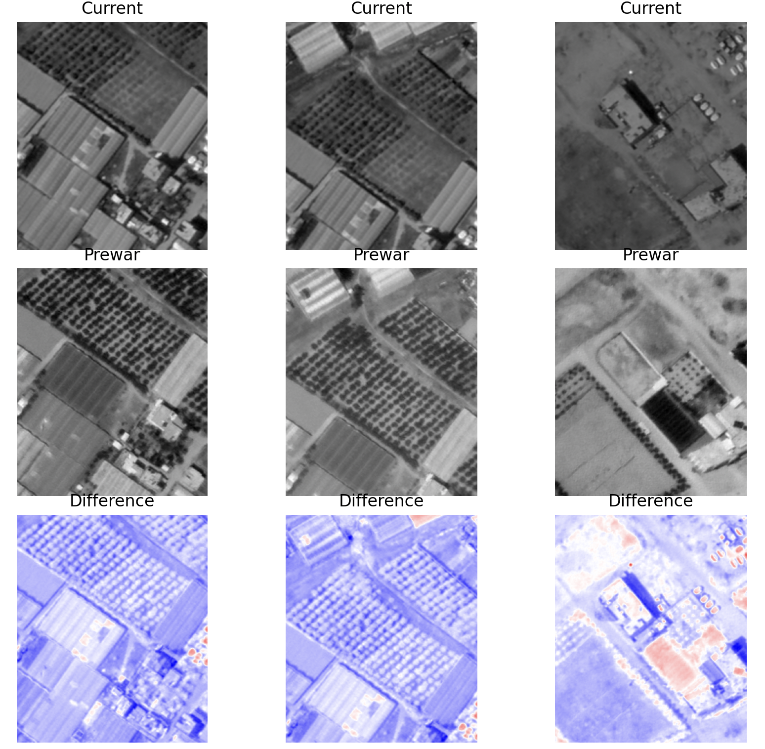 In the Difference image, you can clearly make out the tents in red. The white roof buildings do not show up the same way.
Using this as input data, our final model is essentially a fully convolutional network that maintains spatial resolution throughout (thanks to the padding logic) rather than downsampling with pooling. It is particularly heavy on image context near the end, using dilated and large-kernel convolutions (essentially meaning that it is taking into consideration a very large area of pixels when determining which pixels are tent pixels).
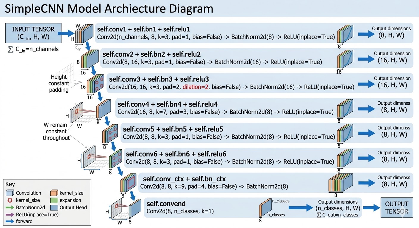 From a more technical perspective, the model looks something like this.
All together, the predictions from this model at the tile level are not bad, often beating the training data labels in accuracy.
 Example results from the model predictions. The first image is the raw data, the second is the labels, and the third is the model predictions – clearly much better than the labels.
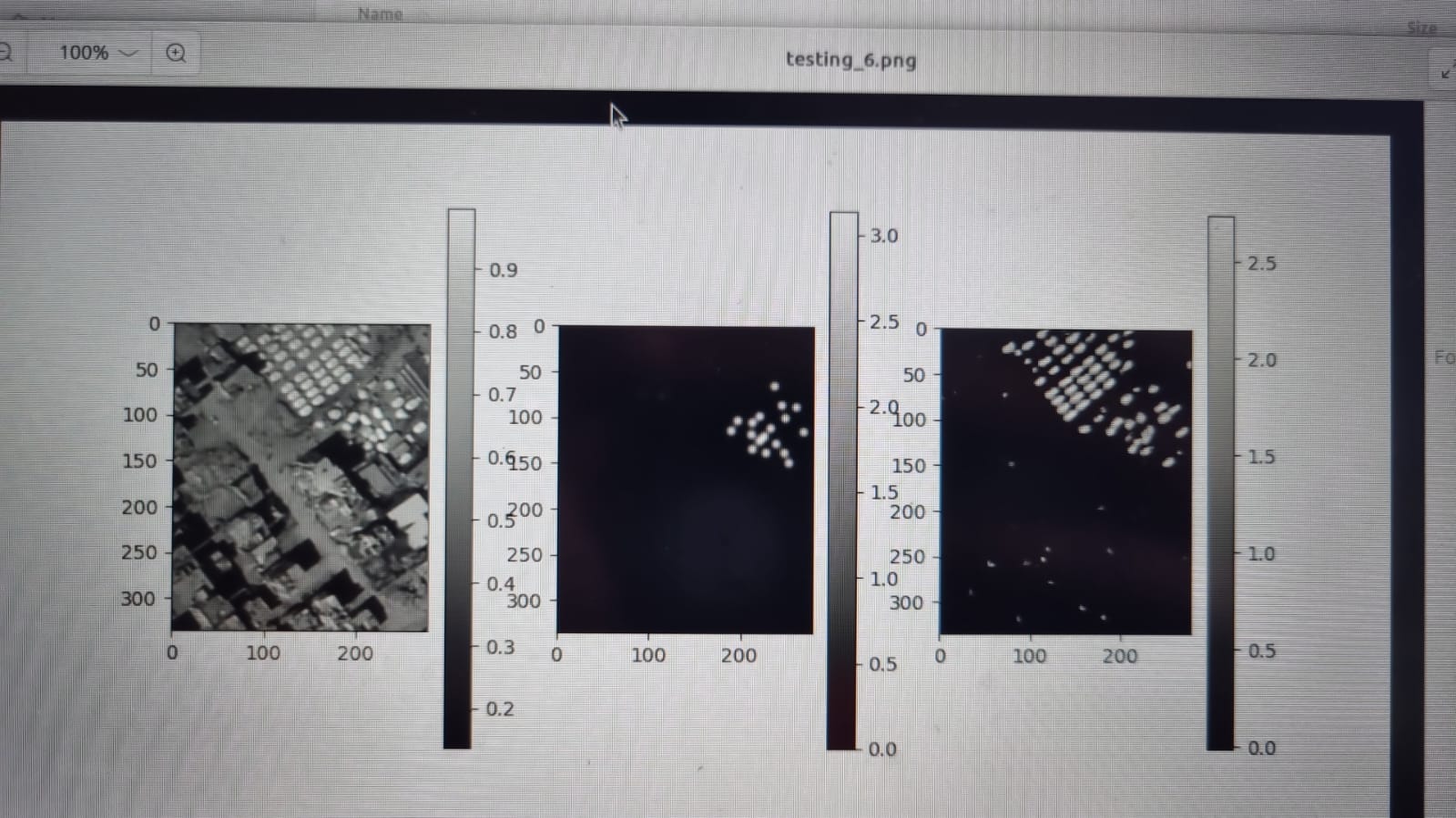
As you can see in the image, the predictions are not single points like we want, but rather blurred circles and oblong shapes. There are also a bunch of tiny specs in the bottom of the image which are just noise. To filter these out, we use a Gaussian filter that essentially gets rid of the small and/or weakly predicted components.
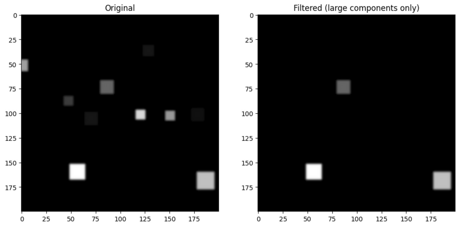 Example result of applying a Gaussian filter to some blocks.
The next problem is turning these weird blobs back into correctly georeferenced points. At first this proved a bit of a challenge, since we were using so many overlapping tiles to make the predictions.
 Clearly not correct.
This is easily fixed with some de-duplication logic that collapses multiple points within a given radius into a single point.
 Fixed.
Results
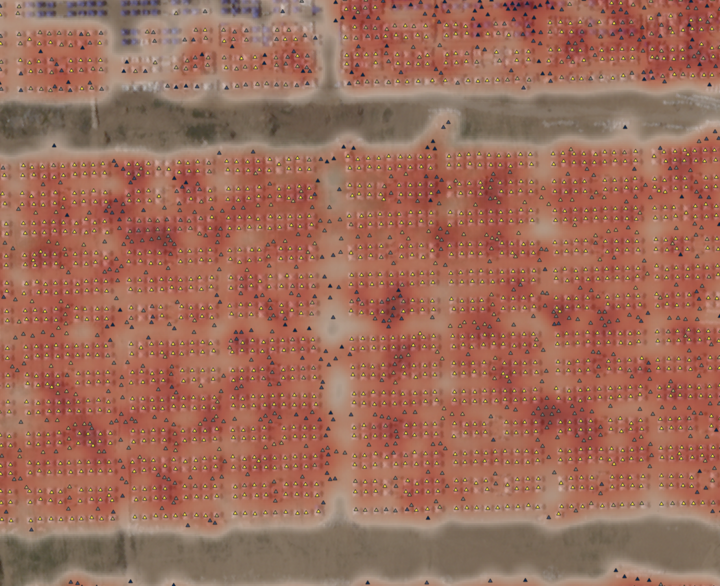
At a glace, the model results seem incredibly impressive. The CNN can annotate and entire TIF file in a few minutes, whereas this would take volunteers days to do.
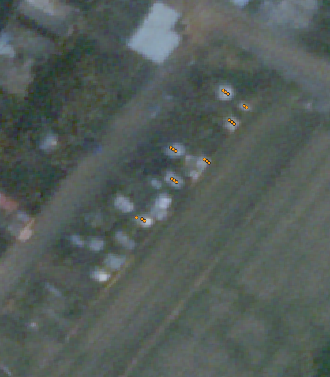
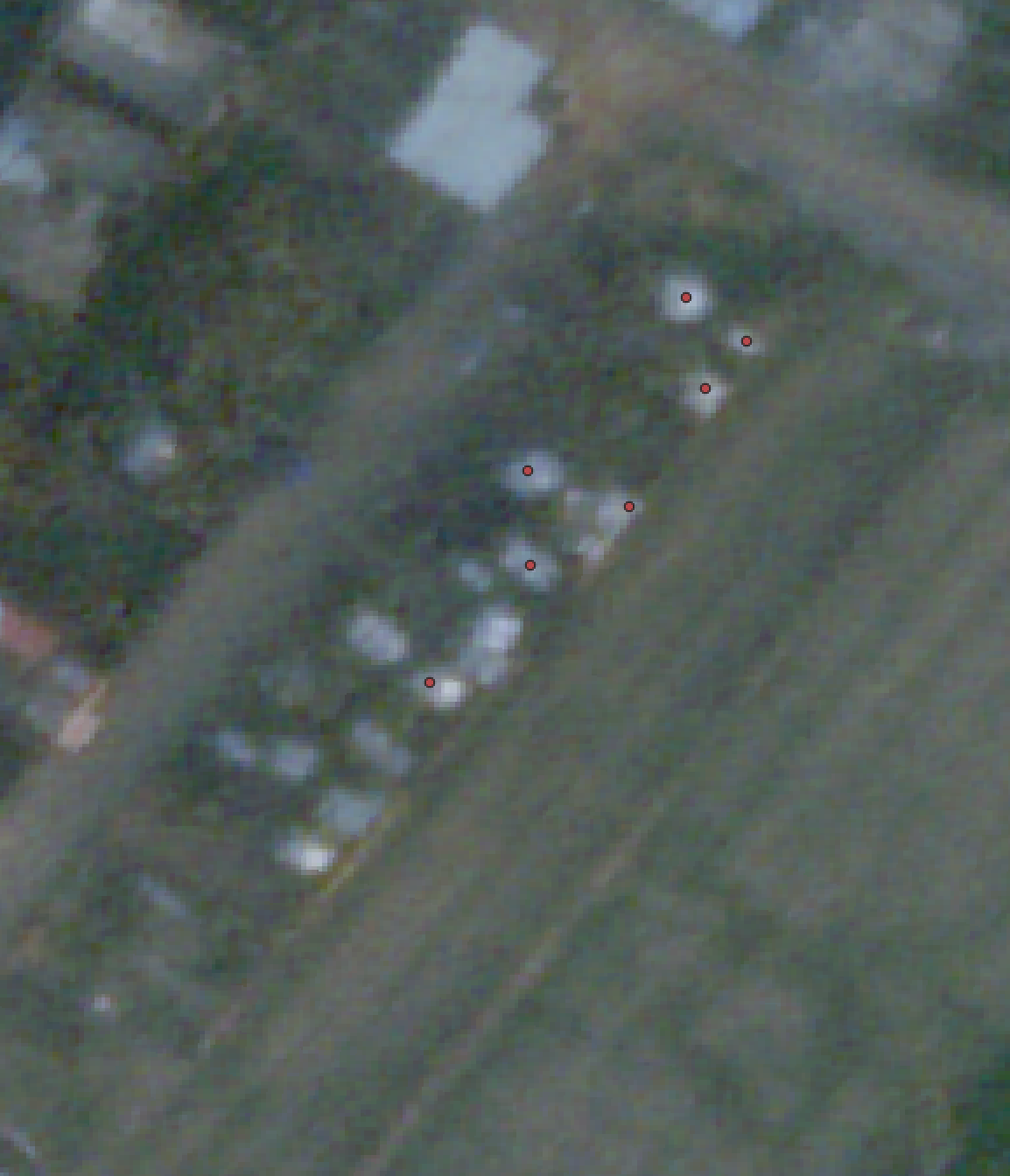
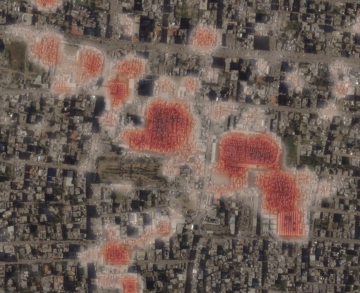
Prewar, current state, and instant annotations made by TentNetFA.
Randomly zooming into places labelled by TentNetFA and checking that they are indeed tents.
Of course, spot checking is not enough. We also needed to quantify the accuracy of the model.
When building models that are going to have some impact on real-world decisions, it is critical that the modellers understand exactly what the end users actually care about. For us, this was accurate neighbourhood-level estimations of displacement (which for us, more concretely, meant accurate counts of tents in each neighbourhood polygon). With this metric in mind, we went about quantifying how well our model performed.
Given the issues with the annotations (even the new annotations done by my volunteers were not entirely perfect), it made sense to do some more rigorous spot checking. I built a quick script that would let me look at a very small tile of a satellite image from the Gaza Strip (one that was not part of our training set), count the number of tents that appeared, and save the result in a table. The script would then also add the count of tents that were predicted by the model to the table, but only after I had written my hand count (to ensure my counting wasn’t influenced by the model predictions).
Count accuracy at the tile level was very good, but clearly the model does not do as well in tiles with incredibly dense tent clusters. In fact, it seems to systemically undercount those (probably as a result of the annotations, where annotaters were overwhelmed by placing thousands of markers in these dense refugee camps).
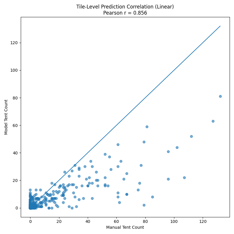 Accuracy at tile level is not bad, predictions correlate well with actual counts.
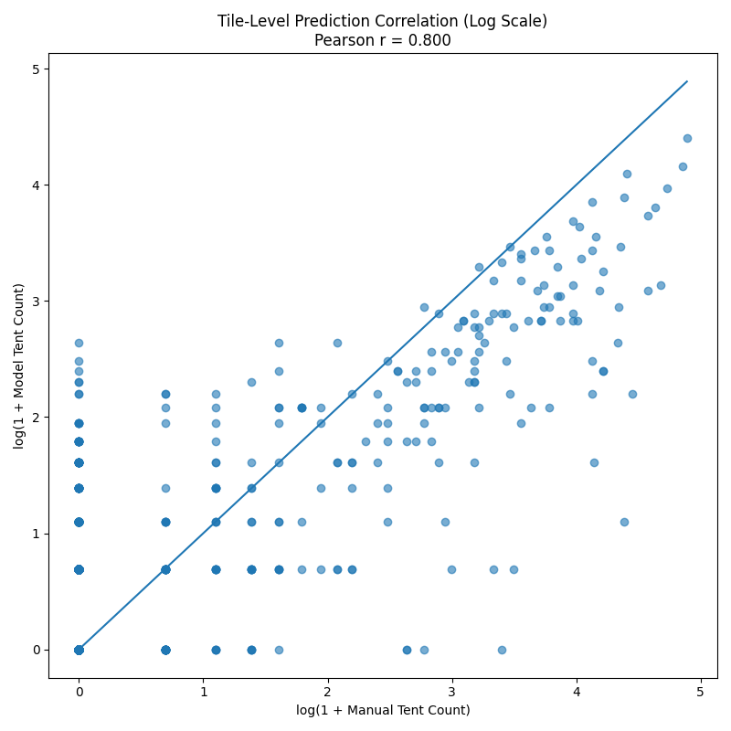 We can look at the log scale to zoom into the lower-count predictions a bit. Accuracy is still good.
The errors are also not spatially uniform, the undercounts are (obviously) much worse in the dense refugee camps in Al-Mawasi and underprediction is worse in areas with a lot of destroyed buildings (which both look different from the prewar image and also have big white lumps that look like tents).
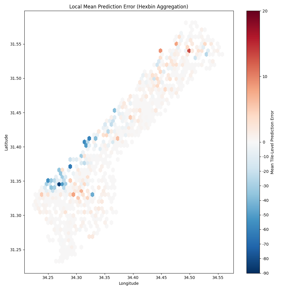 Lack of spatial uniformity in errors.
We can also look directly at the neighbourhood level to assess accuracy.
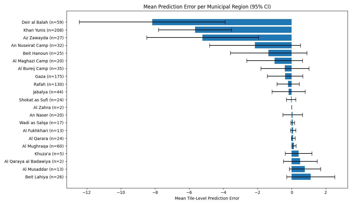 Neighbourhoods that are essentially tent cities have systemic undercounts. However, at the neighbourhood level there are almost no system overcounts (which means relatively few false positives compared to false negative).
All in all, the model is much better than the human annotations and provides useful data for tracking displacement in the Gaza Strip over time, without overstating the level of displacement through disproportionate false negative predictions (i.e. predicting tents where there are no tents).
Impact
Partway through the project, we were introduced to Doug Leasure at the Leverhulme Centre for Demography (who I also cold emailed). He had been working with UNOSAT to provide population estimates that were being used by OCHA to better distribute aid across the Strip. He was incredibly keen to take over work on the project and incorporate the tents mapping into his population estimation work. This means that the work will not just have an impact on estimating retortroactive civilian impacts in the Strip, but will also be able to inform on-the-ground decisions that impact humanitarian outcomes.
I guess this shows how far you can you by having an idea and sending an email.
The project will continue on under his research group, now with funding for maintenance and improvements. One of those improvements is getting better estimates of those dense tent clusters, which was done by setting lower thresholds for what we considered to be a tent in areas where the model was predicting lots of tents.
For live population tracking used for aid distribution, accurately identifying these clusters is critical.
New thresholding methods substantially improve population counts in the dense refugee camps.
The model is open source on GitHub.